Styling Notifications widget
You can style the following entities of the notifications component:
- colors
- border radius
- font
- modal container
Styling colors
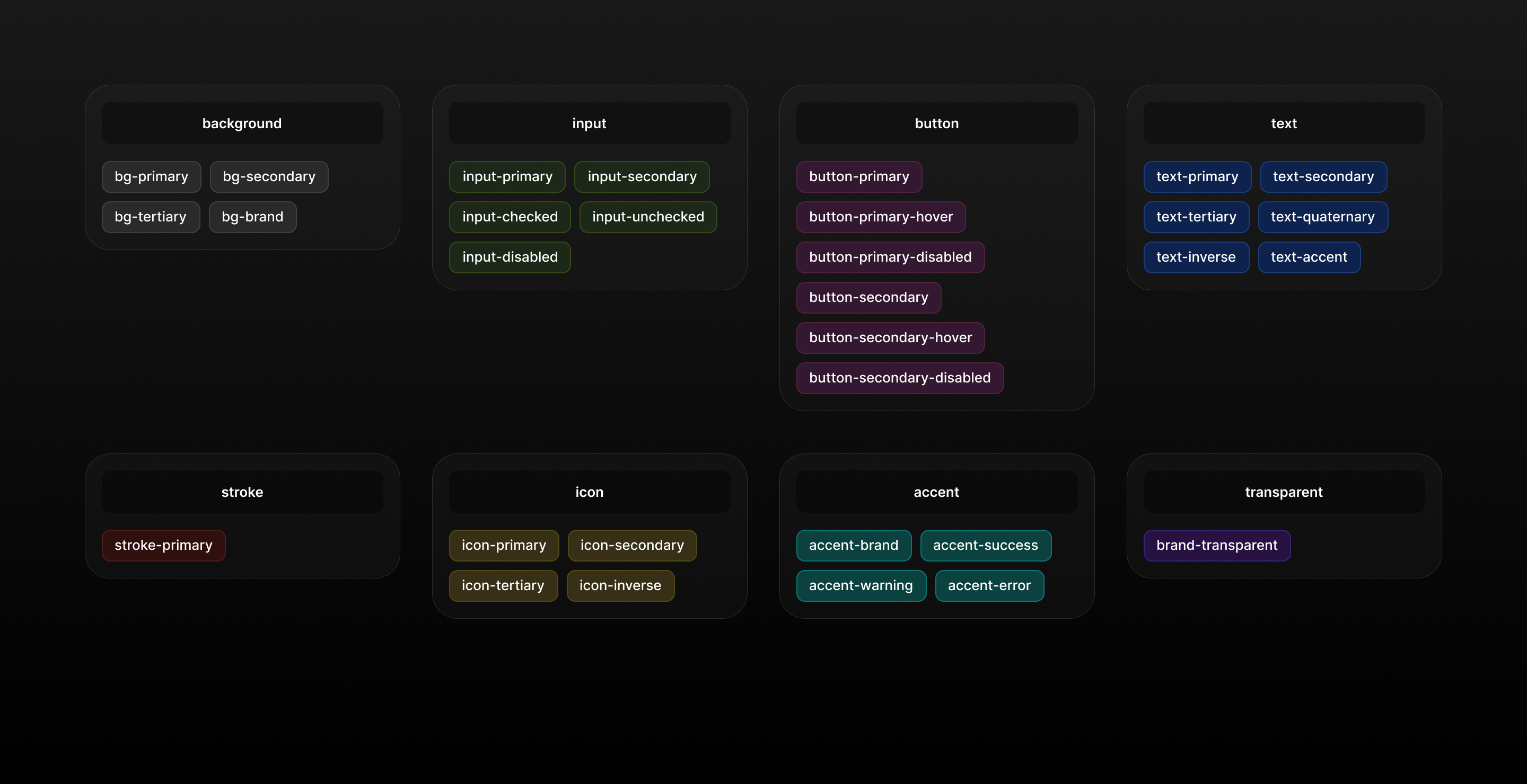
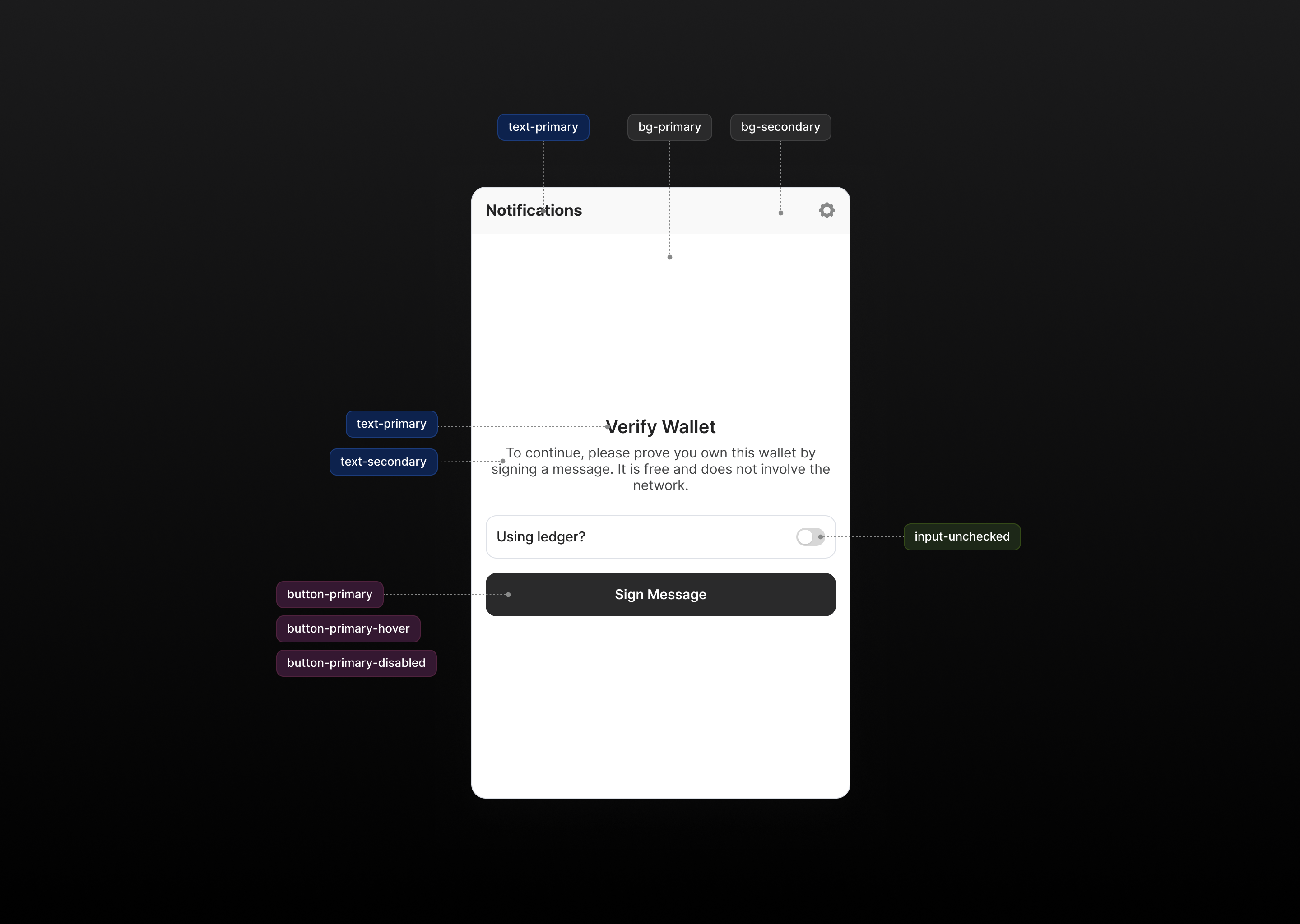
Dialect defines a set of css variables, which are used to color the whole widget:
.dialect {
  --dt-accent-brand: #09cbbf;
  --dt-accent-error: #f62d2d;
  --dt-bg-brand: #ebebeb;
  --dt-bg-primary: #ffffff;
  --dt-bg-secondary: #f9f9f9;
  --dt-bg-tertiary: #f2f3f5;
  --dt-brand-transparent: #b3b3b31a;
  --dt-button-primary: #2a2a2b;
  --dt-button-primary-disabled: #656564;
  --dt-button-primary-hover: #434445;
  --dt-button-secondary: #ebebeb;
  --dt-button-secondary-disabled: #f2f3f5;
  --dt-button-secondary-hover: #f2f3f5;
  --dt-icon-primary: #2a2a2b;
  --dt-icon-secondary: #888989;
  --dt-icon-tertiary: #b3b3b3;
  --dt-input-checked: #09cbbf;
  --dt-input-primary: #dee1e7;
  --dt-input-secondary: #ffffff;
  --dt-input-unchecked: #d7d7d7;
  --dt-stroke-primary: #dee1e7;
  --dt-text-accent: #08c0b4;
  --dt-text-inverse: #ffffff;
  --dt-text-primary: #232324;
  --dt-text-quaternary: #888989;
  --dt-text-secondary: #434445;
  --dt-text-tertiary: #737373;
}
You can override this variables just as any other css variables and specify any other color, or you can reference any other variable in your existing styles, like this:
.dialect {
  --dt-bg-primary: #ff00ff; /* make sure your css is imported after the dialect styles */
  --dt-bg-secondary: #ff00ff !important; /* You might want to add !important tag to avoid css import ordering issue */
  --dt-bg-tertiary: var(
    --my-cool-background
  ); /* You can reference you css variable to avoid copy/paste and handle light/dark theme for example */
}
As an option, you can include dialect styles before your styles by importing it directly in your css file:
@import url('@dialectlabs/react-ui/index.css');
Use the following visual guide to style widget. Please note that css variables are prefixed with --dt
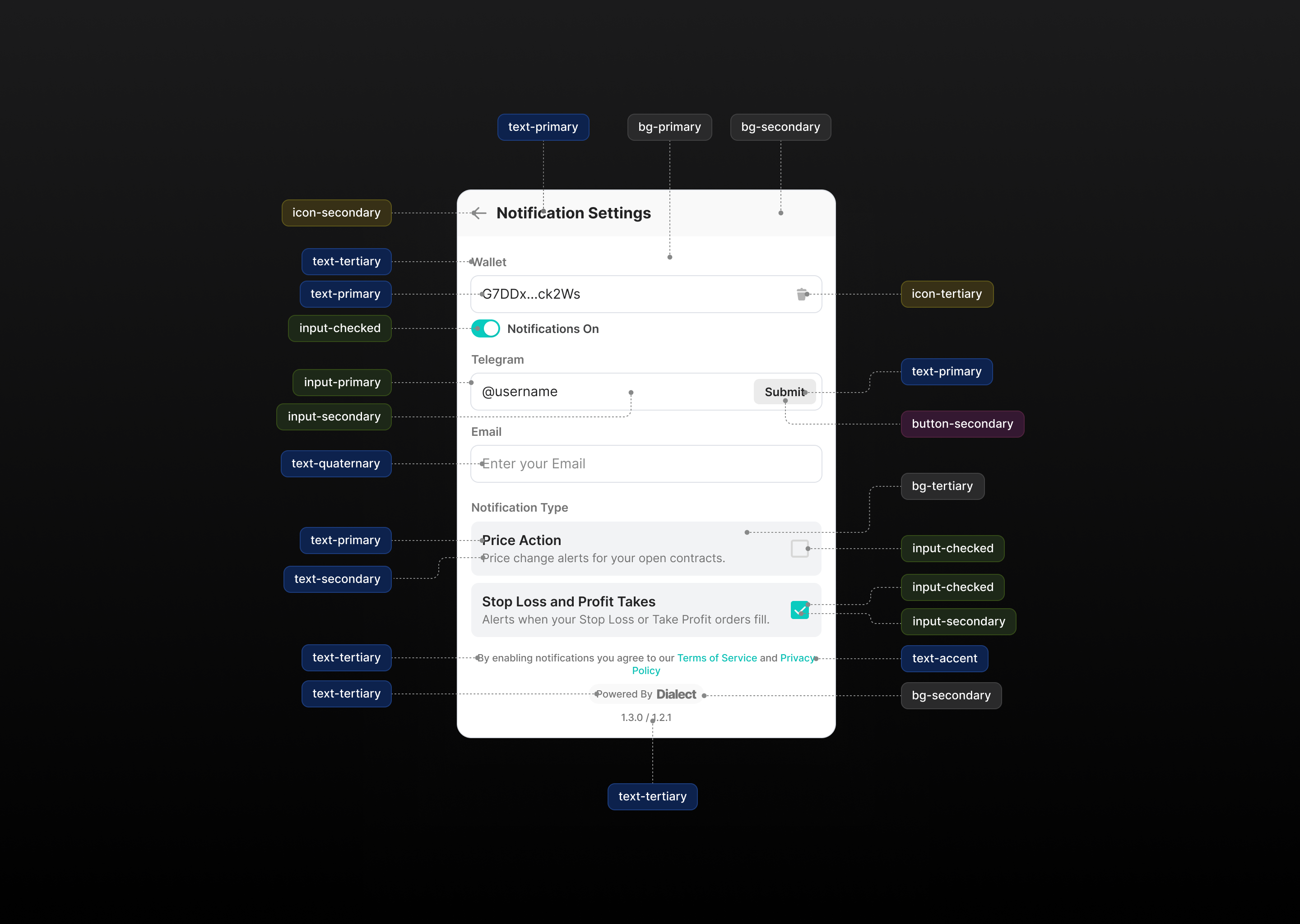
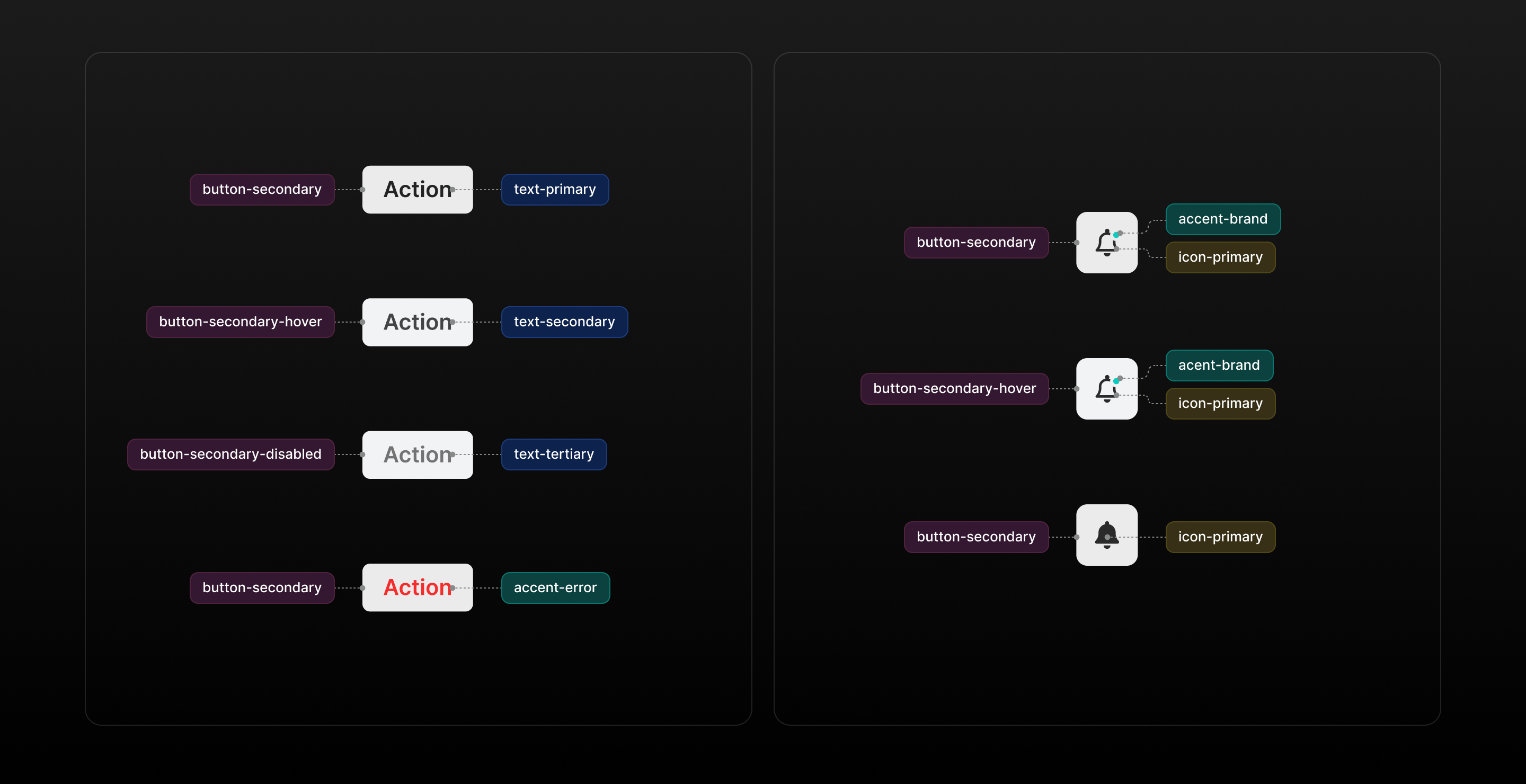
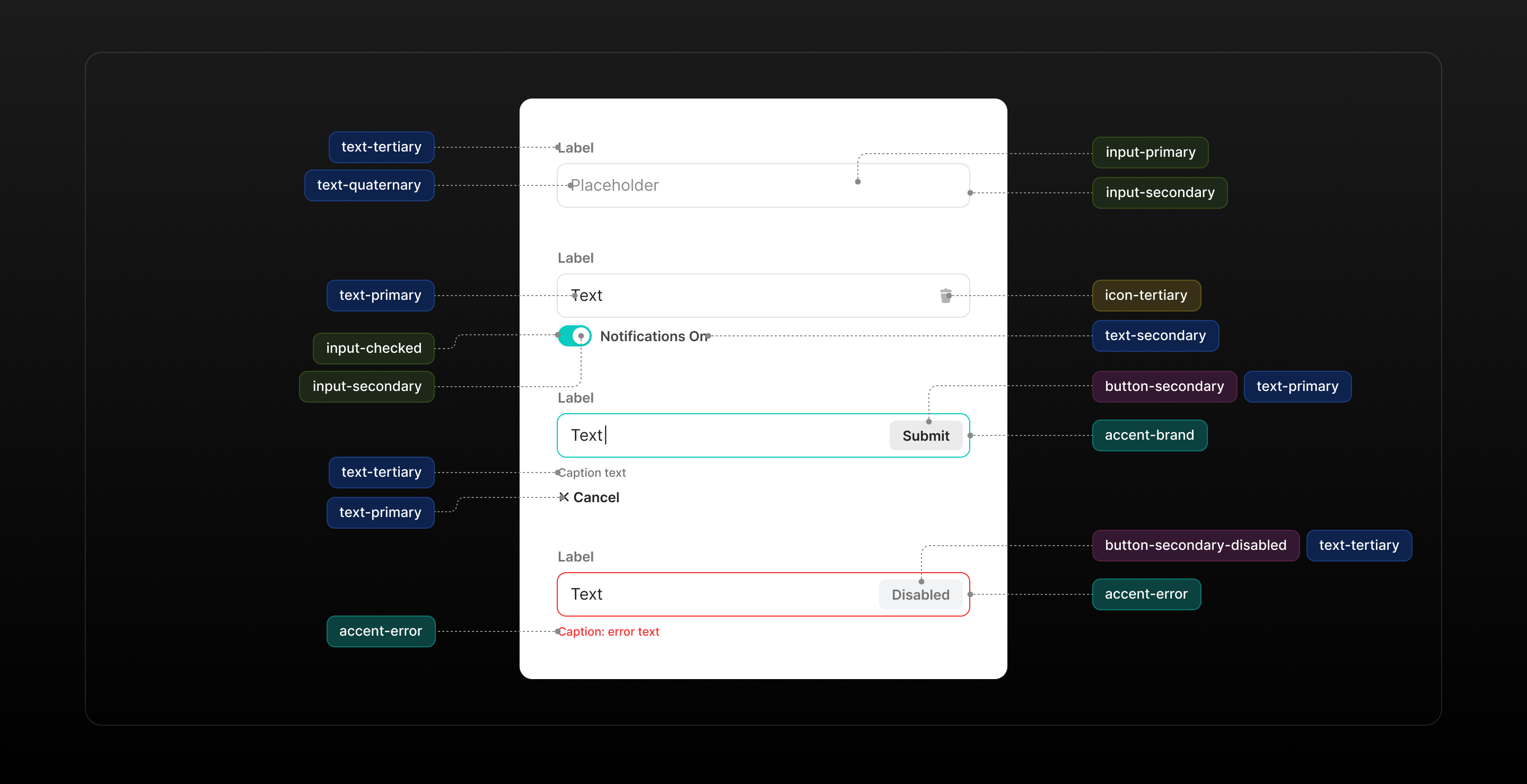
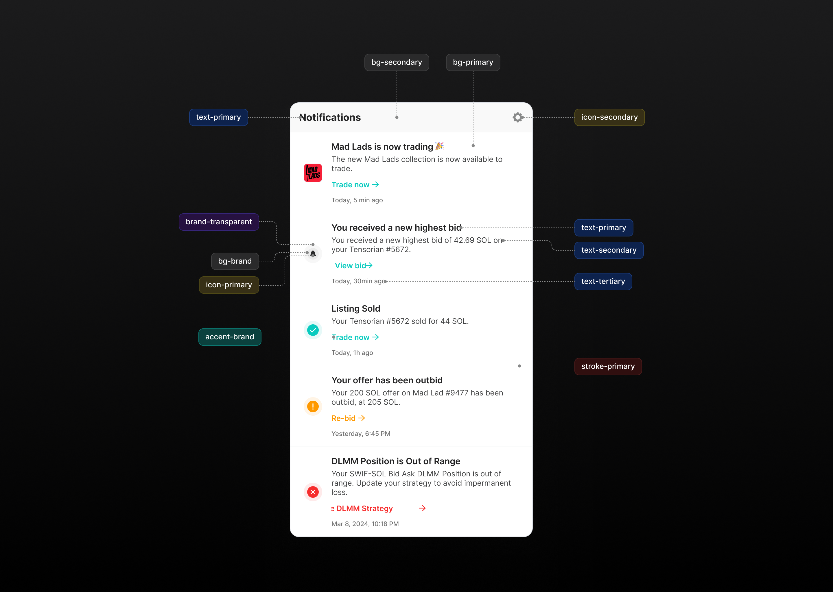
See styling-different-notification-types.md to learn how to style icons/links colors in notifications feed.
Force dark theme
You can force dark theme for dialect component. For this you can pass theme='dark' prop to dialect components.
export const DialectSolanaNotificationsButton = () => {
  return (
    <DialectSolanaSdk dappAddress={DAPP_ADDRESS}>
      <NotificationsButton theme="dark" />
    </DialectSolanaSdk>
  );
};
This would apply a built in dark theme variables:
.dialect[data-theme="dark"] {
  --dt-accent-brand: #09cbbf;
  --dt-accent-error: #ff4747;
  --dt-bg-brand: #656564;
  --dt-bg-primary: #1b1b1c;
  --dt-bg-secondary: #232324;
  --dt-bg-tertiary: #2a2a2b;
  --dt-brand-transparent: #b3b3b31a;
  --dt-button-primary: #ffffff;
  --dt-button-primary-disabled: #dee1e7;
  --dt-button-primary-hover: #f9f9f9;
  --dt-button-secondary: #323335;
  --dt-button-secondary-disabled: #434445;
  --dt-button-secondary-hover: #383a3c;
  --dt-icon-primary: #ffffff;
  --dt-icon-secondary: #888989;
  --dt-icon-tertiary: #737373;
  --dt-input-checked: #09cbbf;
  --dt-input-primary: #434445;
  --dt-input-secondary: #1b1b1c;
  --dt-input-unchecked: #656564;
  --dt-stroke-primary: #323335;
  --dt-text-accent: #09cbbf;
  --dt-text-inverse: #1b1b1c;
  --dt-text-primary: #ffffff;
  --dt-text-quaternary: #888989;
  --dt-text-secondary: #c4c6c8;
  --dt-text-tertiary: #888989;
}
Styling border radius
Dialect defines a set of css variables, which are used to configure border radiuses for the widget:
.dialect {
  --dt-border-radius-xs: 0.375rem;
  --dt-border-radius-s: 0.5rem;
  --dt-border-radius-m: 0.75rem;
  --dt-border-radius-l: 1rem;
}
Styling font
Font should inherit your in-app css font configuration by default. In case if it didn't happened for some reason, you can override it for .dialect css classname.
Styling modal
You can customize .dt-modal css class to change the default modal behavior. Here's the default css styles applied to modal window:
/* mobile phones */
.dialect .dt-modal {
  position: fixed;
  right: 0px;
  top: 0px;
  z-index: 100;
  height: 100%;
  width: 100%;
}
/* tablet/desktop */
@media (min-width: 640px) {
  .dialect .dt-modal {
    position: absolute;
    top: 4rem;
    height: 600px;
    width: 420px;
  }
}
/* styling */
.dialect .dt-modal {
  overflow: hidden;
  border-radius: var(--dt-border-radius-l);
  border-width: 1px;
  border-color: var(--dt-stroke-primary);
}
If you want to bring your own modal container see: